
Best Font Pairings: Choosing the perfect font combinations is crucial for effective graphic design. Some fonts complement each other, while others could go better together. How do you decide? When designing, choosing fonts that contrast nicely instead of conflicting with each other is essential.
We’ve selected some of our favorite font pairings and included tips for creating your own. First, we’ll give you some tips on selecting font combinations, followed by showcasing the top font pairings through examples.
How to choose font pairings: top tips
1. Use font superfamilies
Choosing fonts from the same typeface family is the best way to create great font pairs. There are many ‘super-family’ fonts available for you to choose from. It makes it easier to select font pairings that will complement each other. A quality super-family should include both a Serif and a Sans Serif version of a typeface.
2. Pair contrasting typefaces
Finding fonts with contrasting styles can be challenging because you need to look for two distinct fonts that harmonize well together. When typefaces are too alike, they may clash. For instance, fonts that are too similar in style don’t usually complement each other well. Our mind is left wondering – is this a different font or not? Pairing a serif font with a sans-serif font can create a nice contrast.
It’s crucial to ensure a good balance of personalities when pairing fonts. For instance, if you have a distinctive display font with lots of personality, you’ll require something more neutral to balance it out. Make sure to establish a clear hierarchy in your font pairings by defining the purpose of each one. Which text is for display, and which is for body text? Even if you’re not combining fonts, this still applies. Stick to one font and play around with weight, size, or color.
3. Pair type sub-categories
Classifications like ‘serif’ and ‘sans serif’ are broad and can be divided into sub-categories. Old Style serifs like Bembo, Caslon, and Garamond pair nicely with Humanist sans serifs such as Gill Sans and Lucida Grande.
Transitional serifs fonts like Bookman, Mrs. Eaves, Perpetua, and Times have a noticeable difference between thick and thin strokes. These fonts go well with geometric sans serifs such as Avant Garde, Avenir, Century Gothic, Eurostile, Futura, and Univers.
Modern serifs have a dramatic contrast between thick and thin for a stylized effect and a larger x-height. This category includes Bodoni, Didot, New Century Schoolbook, and Walbaum. Geometric sans serifs work well with these fonts.
4. Consider the weight
The boldness and thickness of the text determine font-weight. There are various weights available depending on the fonts you choose. Headlines and titles typically require a heavier weight, while the main body of text benefits from a lighter feel. Choosing font weights that work well together is crucial. Experiment with different styles to achieve a unique look that fits your project.
The best font pairings: 30 perfect examples
Discover additional tips below, with our selection of favorite font pairings for inspiration.
1. Aldus & Astoria Sans

Aldus was developed as a modern version of the Old Face typeface. Named after the renowned Venetian printer Aldus Manutius, this font exudes the graceful charm of Renaissance-style typography. Combined with the contemporary Astoria Sans, which draws inspiration from the humanist sans-serif Gill, the fonts produce a sleek and timeless appearance suitable for various projects.
2. Century Gothic & PT Serif
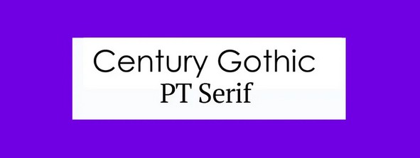
Century Gothic was created as an alternative to Avant Garde. It is designed using Monotype 20th Century and has been adjusted to work well on modern digital platforms while keeping a timeless vibe. This font complements PT Serif, a classic typeface designed by ParaType. This pairing naturally complements each other, creating a timeless look that never goes out of style.
3. Calvert and Acumin
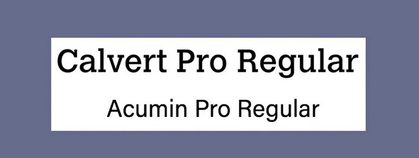
Calvert is a punchy slab serif font created by Margaret Calvert and available from Monotype. There are six styles available: Calvert Pro and Standard, with Light, Regular, and Bold variants for each. Consider using an Acumin sans-serif font for a perfect pairing. This typeface includes 90 different fonts. If you need clarification on font and typeface differences, check out our explanation. Created by Robert Slimbach for the Adobe Originals project, this font can be accessed with an Adobe Creative Cloud subscription.
4. Montserrat and Courier New
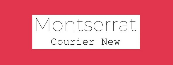
Google Font Montserrat was created for online use, while Courier New is a traditional typewriter font (check out our guide to the best typewriter fonts for more options). Despite their distinct purposes, you may expect these fonts to pair poorly, but they complement each other beautifully. Montserrat’s contemporary sans-serif letters complement the vintage feel of Courier New nicely.
5. Skolar Latin and Proxima Nova
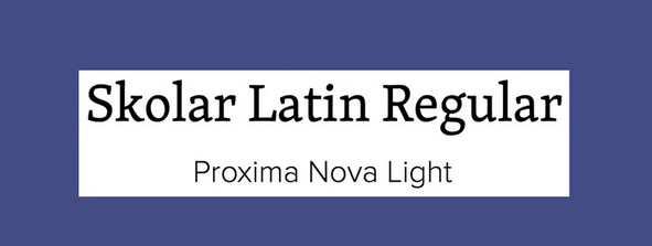
Rosetta’s description of Skolar is a typeface designed for complex typography. Skolar has a wide character set and supports Latin, Cyrillic, Greek, Devangari, and Gujarati scripts. The font has low contrast, a large x-height, and strong serifs, making it easy to read even at small sizes. Our ideal font combination for Skolar is the well-known web font Proxima Nova, created by Mark Simonson. It combined contemporary proportions with a geometric look.
6. Alegreya Sans SC and Source Sans Pro

Created by Juan Pablo del Peral for Huerta Tipográfica, Alegreya is a versatile superfamily consisting of both sans and serif sister families and a small caps version. This font style has a touch of calligraphy and is ideal for lengthy text passages. Yet, the small caps version works best for headers. Consider using it with Source Sans Pro, Adobe’s initial open-source typeface family created by Paul D. Hunt.
7. Pacifico and Quicksand
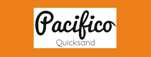
Pair Pacifico and Quicksand for a fun font combination with a hint of tropical vibes. Pacifico is a fun brush font perfect for headings, while Quicksand is a sans-serif font with rounded terminals and unique details like the descender on the uppercase ‘Q.’ Quicksand was initially created as a display typeface, but it is also clear enough to be effective in small sizes.
8. Julius Sans One and Archive Narrow
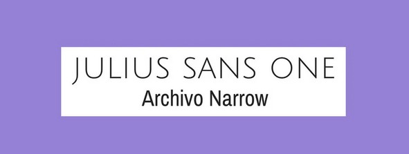
For a polished and professional appearance, consider experimenting with this font combination. Julius Sans One is an all-caps font with a single weight. Its fine stroke and broader baseline make it a popular choice for display. Archivo Narrow’s geometric design makes it a versatile option for print and digital use.
9. Playfair Display and Raleway
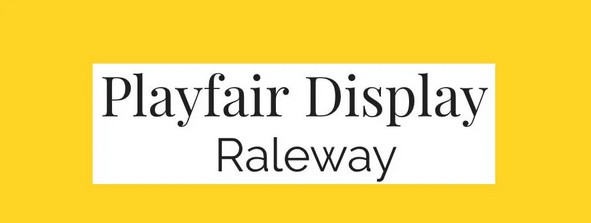
Playfair display font is inspired by the transition from quills to steel pens in the 18th century. It, along with advancements in printing, resulted in the rise of high-contrast letterforms featuring delicate hairlines. Raleway, a stylish sans serif font, pairs perfectly with others.
10. Oswald and Lato

Oswald was introduced 2011 as a modern version of the ‘Alternate Gothic’ sans-serif typeface. It pairs well with Lato (‘summer’ in Polish), a warm and reliable sans serif font. This font pairing offers a wide range of weights and variants, making it versatile.
11. Super Grotesk and Minion Pro

Minion Pro is an excellent headline choice for body text paired with Super Grotesk. These fonts work together to establish a modern and elegant feel.
12. Libre Franklin and Libre Baskerville
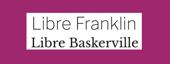
These two libre typefaces work well together for a classic vibe. Libre Baskerville and Libre Franklin are both designed for optimal screen use. The first option is great for body text, while the second is more suitable for headlines. This combination offers nine weight options, making it versatile.
13. Freight Sans and Freight Text

Collaborating within superfamilies simplifies the process of discovering complementary font combinations. Freight from GarageFonts is an excellent example. It comes in various weights and styles like Sans, Text, Display, and Micro versions, providing a versatile typographic toolkit.
14. Kaufmann and NeutraDemi
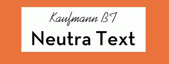
Looking for a unique option? What about this pair? Kaufmann’s flowing stylings bring a handwritten flair to this odd couple, perfectly contrasting with the straight and angular NeutraDemi. This font combination may seem an obscure choice, but they complement each other quite nicely.
15. Brandon Grotesque and Minion Pro
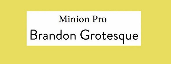
Minion Pro is a reliable and versatile font featured multiple times in this list. It’s in a supporting role to the bold and attention-grabbing Brandon Grotesque. It is a traditional combination of serif and sans-serif fonts, both easy to read and clear in any layout.
16. Josefin Slab and Patrick Hand
Designer Santiago Orozco aimed for a blend of Kabel and Memphis styles with modern details when creating Josefin Slab. The final font has unique typewriter-style elements, making it perfect for headlines. Mix it with body text in Patrick Hand for a font combination full of personality. The latter exudes a neat and friendly vibe based on the designer’s handwriting.
17. Helvetica Neue and Garamond
Combining Neo-Grotesque sans serif Helvetica Neue for headlines with the classic Old Style serif Garamond for text is a well-known and harmonious font pairing. Combine various weights and sizes from these neutral typefaces to establish a clear hierarchy in your designs.
18. Caslon and Myriad
A classic font pairing: an 18th-century Old Style serif with a late-20th-century Humanist sans serif. Before it changed to San Francisco, Myriad was well-known for being used in Apple’s corporate communication. It is also featured in the Rolls Royce logo.
19. Nova Mono and Lato
Nova Mono comes in just one style, perfect for making a bold statement. Combine it with the flexible sans serif font Lato to maintain a balanced look. The designer Łukasz Dziedzic aimed for a font that is clear at small sizes and reveals stylized effects when used larger.
20. Fontin and Fontin Sans
Introducing another superfamily from the Dutch foundry exljbris. Fontin is ideal for small sizes. It has wide spacing and a high x-height. Fontin Sans is the perfect choice.
21. Minion and Poppl-Laudatio
Both typefaces have distinct personalities that complement each other perfectly. Minion is an Old Style serif typeface designed in 1990, inspired by late Renaissance-era type. Poppl-Laudatio is technically a sans-serif font, but its subtle flared details add a quirky edge.
22. Liberation Serif and Liberation Sans
The Liberation superfamily was created as an open-source alternative to popular Windows fonts like Arial, Times New Roman, and Courier New. The Serif and Sans fonts pair well together, and there are other options to experiment with, such as Sans Narrow and Mono.
23. Trade Gothic Bold and Sabon
Using Trade Gothic in its Bold weight for headlines complements Jan Tschichold’s classic Old Style serif face for text. Both fonts are easy to read, with a tall x-height, and work well together to create a pleasing effect.
24. Gilroy and Jura
This sans serif pair is excellent for achieving a stylish, industrial aesthetic. Gilroy’s geometric style in ExtraBold weight is perfect for headers, complemented nicely by Jura Light with its wiry, structured shape. This pairing enhances the technical aspect of creative projects.
25. Orpheus Pro and Twentieth Century
Let’s look back at the 1920s with this typeface designed by Sol Hess for Monotype. The Twentieth Century font has an attractive Art Deco style that is subtle in this version but more glamorous in the Twentieth Century Std Poster MT variant. Consider using Orpheus Pro from Canada Type for an ideal type pairing. This font was initially intended to be a modernized version of Walter Tiemann’s Orpheus and Euphorion fonts. However, it evolved into a more intricate design with various extensions, alternates, swashes, and ligatures, making it ideal for display use.
26. Playfair Display and Source Sans Pro
Playfair Display is a dedicated display typeface known for its high contrast, adding a touch of old-fashioned charm. Source Sans Pro is a modern sans-serif font created for user interfaces. They complement each other well, combining the subtle Source Sans Pro with the standout Playfair Display font.
27. Scala and Scala Sans
FontFont’s Scala superfamily started with a serif version in 1990 and later introduced a sans serif companion in 1992. This font family is highly versatile, with small caps, various ligatures, and old-style figures, making it a popular choice for publishing.
28. Bebas Neue and Montserrat Light
Bebas Neue is an excellent headline option due to its clean and condensed letterforms. It’s available for free download and is open-source. You can customize it to your specific needs by editing the GitHub repository if you desire and have the skills. Montserrat provides a pleasant contrast, particularly the Light version.
29. Rockwell Bold and Bembo
Rockwell, a classic slab serif, was designed in the 1930s. It exudes a vibrant personality and commands attention when used in bold. Bembo, a conservative serif font, is neutral and versatile, making it an ideal choice for pairing with other fonts.
30. Myriad Black and Minion
Myriad and Minion are also featured in other font pairings in this list, but this particular combination is worth considering. The bold Black version of one and the text weight of the other can create a clear design hierarchy.
What font pairings should I choose for different types of projects?
The font pairings you choose may vary depending on the project you’re working on. CVs require bold headers and simple body text. In contrast, event flyers and posters benefit from eye-catching display text to attract attention and clear body text for easy reading of key information.
When creating social media content, choose clear fonts that are easy to read. Consider using a bold, stylish font for display text and a crisp font for the body. Event invitations often pair a script font for the display text with an elegant yet clean and legible sans serif for the body copy.